Process
We spent a few months creating concepts for how we believe this technology could be used. Our explorations extend beyond wayfinding, but we picked a use case that resonated with both of us to explore deeper. Here's a brief look at how we created our wayfinding concept.
Process
We spent a few months creating concepts for how we believe this technology could be used. Our explorations extend beyond wayfinding, but we picked a use case that resonated with both of us to explore deeper. Here's a brief look at how we created our wayfinding concept.
Process
We spent a few months creating concepts for how we believe this technology could be used. Our explorations extend beyond wayfinding, but we picked a use case that resonated with both of us to explore deeper. Here's a brief look at how we created our wayfinding concept.
Process
We spent a few months creating concepts for how we believe this technology could be used. Our explorations extend beyond wayfinding, but we picked a use case that resonated with both of us to explore deeper. Here's a brief look at how we created our wayfinding concept.
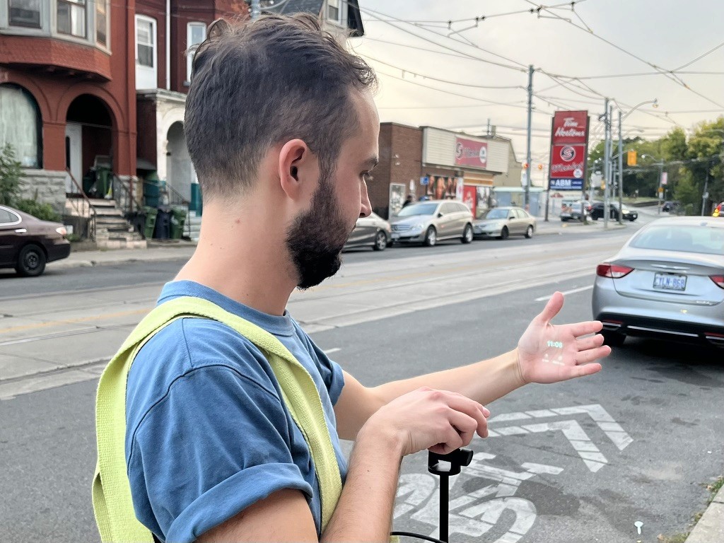
Pocket-sized projector. We designed our interfaces and prototyped them using a pico projector, and later took that projector out into the world to film our concepts and tell the story of how we think this could work.
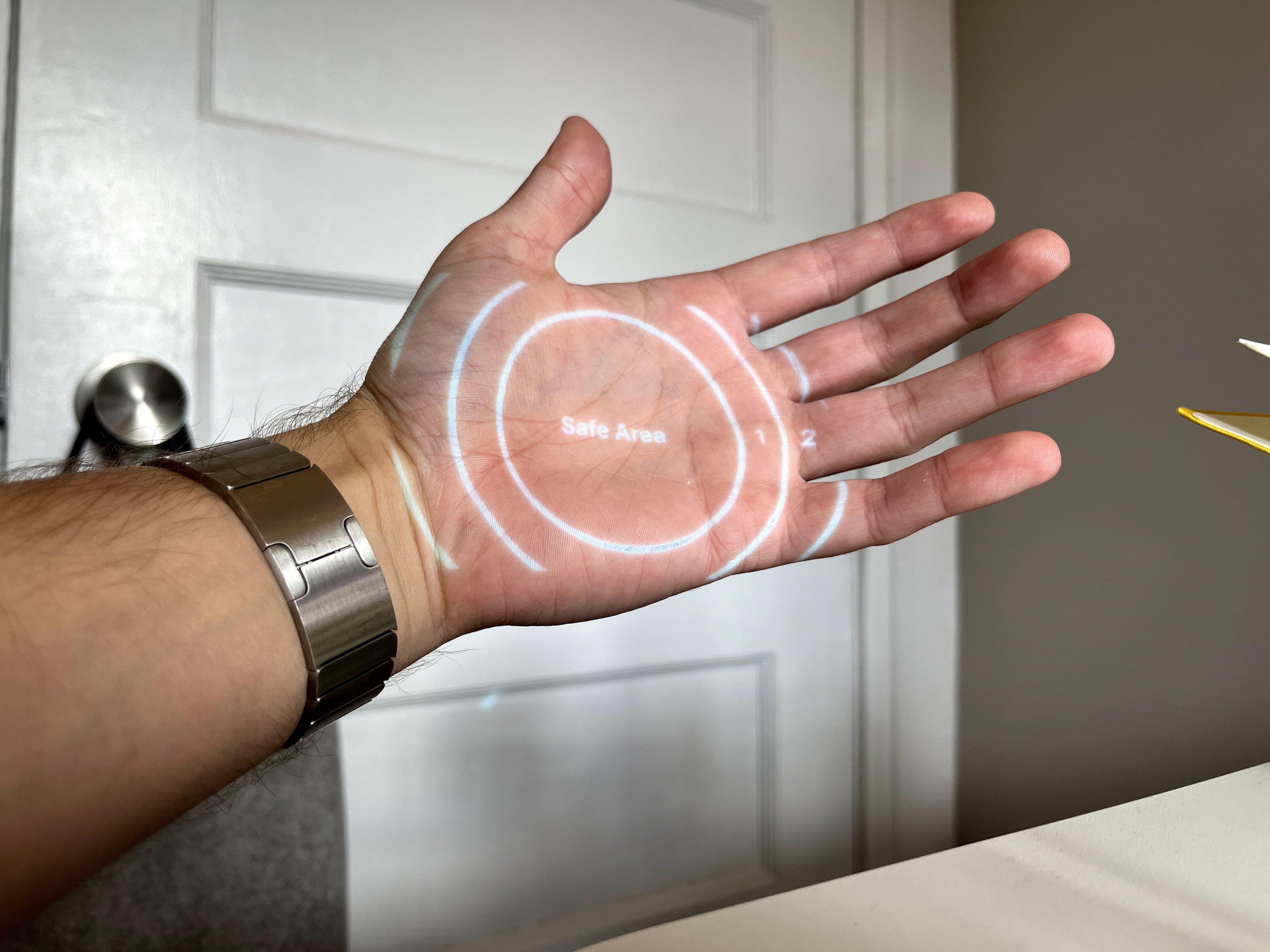
Architecture. We hypothesized that projected hardware could utilize a laser scanner for its small size, energy efficiency, and always in focus capabilities. To experiment, we projected images on our hand, and developed guidelines for ourselves so we knew how to position and scale UI elements.

Font and line weights. To better understand laser projectors, we created a series of tests to help us understand which fonts, line weights, and shapes were ideal for legibility under bright and dark environments.
Iterative prototyping. By using tools like Figma, Origami, and Keynote, we were able to quickly stress test ideas. This early demo shows a compass arrow that adjusts its perspective based on your hand position.
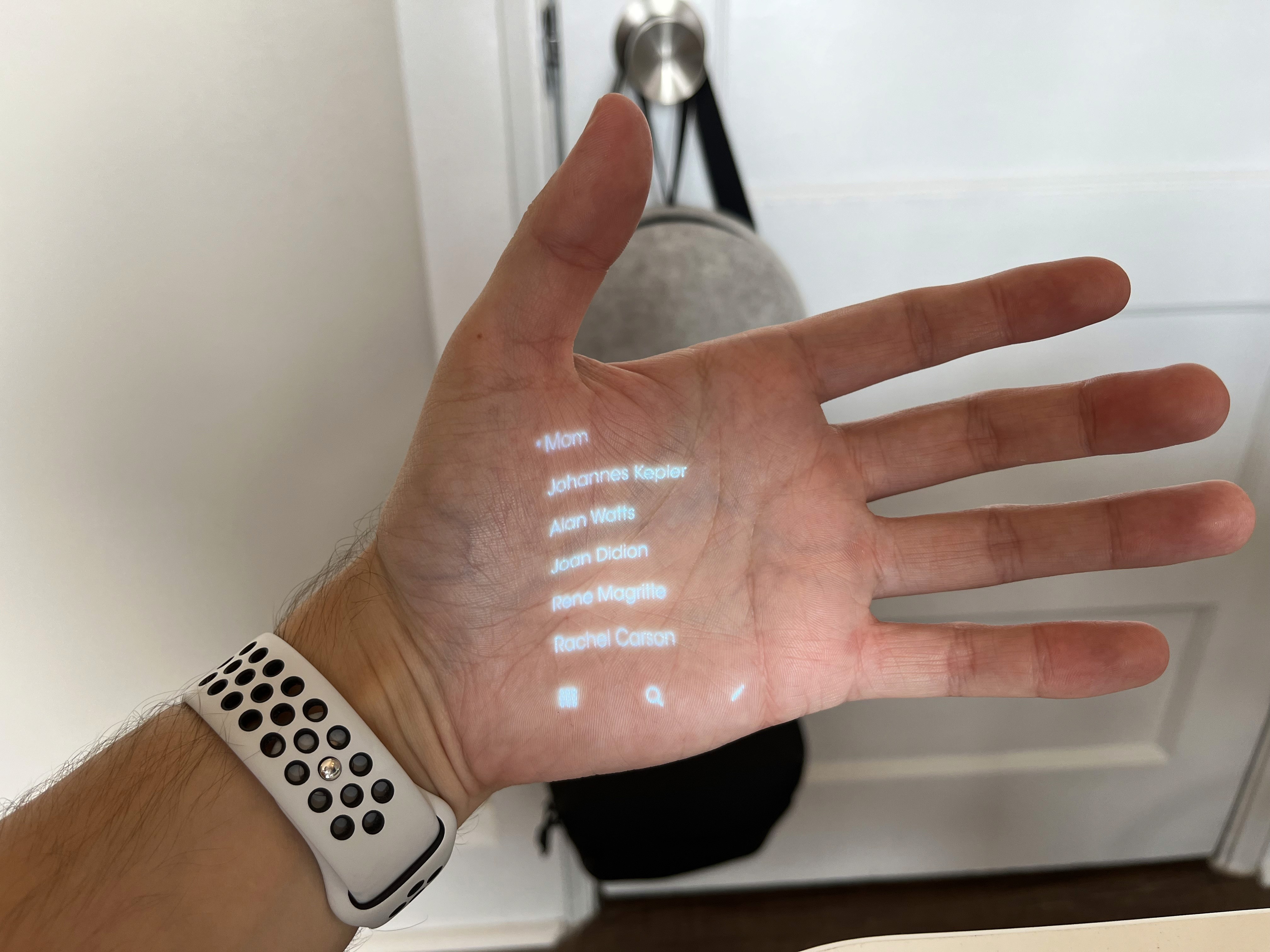
Inspiration. Light Phone II is designed as a communication tool that reduces distractions. We were inspired by its interface and tried projecting it as an early experiment, which helped to inform the level of detail we would use in our own screens.
One handed operation. For times when your hands are full, we felt that the hardware should still work with one hand. In this example, we show how you could return to a dashboard or “home” state by closing your palm. This correlates with you "closing" an activity.
Primary gestures. We wondered if you might be able to display interface elements on your fingertips that could be easily tapped. This solution feels very ergonomically friendly, which is why we also feature it in our concepts.
While we’re not sure if the hardware will be able to project onto a target this small, we love the idea of UI on our fingertips.
Common interactions. We tested our interaction mechanisms on common visual elements such as lists. This demo explores scrolling lists using a two-handed gesture.
The interfaces we pursued for this concept ended up reducing the need to scroll by displaying minimal information, intelligently curated to the user’s needs.
Animations and haptics. We felt that multi-modal feedback —visual cues, sound, and haptics— would be critical for Wayfinding. To demonstrate these scenarios, we built animations to work alongside the potential hardware.
Ambient awareness. We imagine AI-powered hardware may be able to listen to announcements for you so you never have to worry about missing an important update. Your device could transcribe and alert you about relevant trip updates, without you needing to pay close attention to what's being said.
Dynamic, contextually aware interface. We imagine that the interface could seamlessly transition and adapt based on an understanding of your surroundings. Less manual control would mean a more intelligent interface could show just the right information, without you needing to interact in any way.

Countless hours of Facetime calls. We live far away from each other, and spent many hours on the phone working through concepts, sharing ideas, excitedly going off on tangents, and having loads of fun. We'll be continuing to work on projects that excite us, and hopefully one day we can do that work in the same room.

Pocket-sized projector. We designed our interfaces and prototyped them using a pico projector, and later took that projector out into the world to film our concepts and tell the story of how we think this could work.

Architecture. We hypothesized that projected hardware could utilize a laser scanner for its small size, energy efficiency, and always in focus capabilities. To experiment, we projected images on our hand, and developed guidelines for ourselves so we knew how to position and scale UI elements.

Font and line weights. To better understand laser projectors, we created a series of tests to help us understand which fonts, line weights, and shapes were ideal for legibility under bright and dark environments.
Iterative prototyping. By using tools like Figma, Origami, and Keynote, we were able to quickly stress test ideas. This early demo shows a compass arrow that adjusts its perspective based on your hand position.

Inspiration. Light Phone II is designed as a communication tool that reduces distractions. We were inspired by its interface and tried projecting it as an early experiment, which helped to inform the level of detail we would use in our own screens.
One handed operation. For times when your hands are full, we felt that the hardware should still work with one hand. In this example, we show how you could return to a dashboard or “home” state by closing your palm. This correlates with you "closing" an activity.
Primary gestures. We wondered if you might be able to display interface elements on your fingertips that could be easily tapped. This solution feels very ergonomically friendly, which is why we also feature it in our concepts.
While we’re not sure if the hardware will be able to project onto a target this small, we love the idea of UI on our fingertips.
Common interactions. We tested our interaction mechanisms on common visual elements such as lists. This demo explores scrolling lists using a two-handed gesture.
The interfaces we pursued for this concept ended up reducing the need to scroll by displaying minimal information, intelligently curated to the user’s needs.
Animations and haptics. We felt that multi-modal feedback —visual cues, sound, and haptics— would be critical for Wayfinding. To demonstrate these scenarios, we built animations to work alongside the potential hardware.
Ambient awareness. We imagine AI-powered hardware may be able to listen to announcements for you so you never have to worry about missing an important update. Your device could transcribe and alert you about relevant trip updates, without you needing to pay close attention to what's being said.
Dynamic, contextually aware interface. We imagine that the interface could seamlessly transition and adapt based on an understanding of your surroundings. Less manual control would mean a more intelligent interface could show just the right information, without you needing to interact in any way.

Countless hours of Facetime calls. We live far away from each other, and spent many hours on the phone working through concepts, sharing ideas, excitedly going off on tangents, and having loads of fun. We'll be continuing to work on projects that excite us, and hopefully one day we can do that work in the same room.

Pocket-sized projector. We designed our interfaces and prototyped them using a pico projector, and later took that projector out into the world to film our concepts and tell the story of how we think this could work.

Architecture. We hypothesized that projected hardware could utilize a laser scanner for its small size, energy efficiency, and always in focus capabilities. To experiment, we projected images on our hand, and developed guidelines for ourselves so we knew how to position and scale UI elements.

Font and line weights. To better understand laser projectors, we created a series of tests to help us understand which fonts, line weights, and shapes were ideal for legibility under bright and dark environments.
Iterative prototyping. By using tools like Figma, Origami, and Keynote, we were able to quickly stress test ideas. This early demo shows a compass arrow that adjusts its perspective based on your hand position.

Inspiration. Light Phone II is designed as a communication tool that reduces distractions. We were inspired by its interface and tried projecting it as an early experiment, which helped to inform the level of detail we would use in our own screens.
One handed operation. For times when your hands are full, we felt that the hardware should still work with one hand. In this example, we show how you could return to a dashboard or “home” state by closing your palm. This correlates with you "closing" an activity.
Primary gestures. We wondered if you might be able to display interface elements on your fingertips that could be easily tapped. This solution feels very ergonomically friendly, which is why we also feature it in our concepts.
While we’re not sure if the hardware will be able to project onto a target this small, we love the idea of UI on our fingertips.
Common interactions. We tested our interaction mechanisms on common visual elements such as lists. This demo explores scrolling lists using a two-handed gesture.
The interfaces we pursued for this concept ended up reducing the need to scroll by displaying minimal information, intelligently curated to the user’s needs.
Animations and haptics. We felt that multi-modal feedback —visual cues, sound, and haptics— would be critical for Wayfinding. To demonstrate these scenarios, we built animations to work alongside the potential hardware.
Ambient awareness. We imagine AI-powered hardware may be able to listen to announcements for you so you never have to worry about missing an important update. Your device could transcribe and alert you about relevant trip updates, without you needing to pay close attention to what's being said.
Dynamic, contextually aware interface. We imagine that the interface could seamlessly transition and adapt based on an understanding of your surroundings. Less manual control would mean a more intelligent interface could show just the right information, without you needing to interact in any way.

Countless hours of Facetime calls. We live far away from each other, and spent many hours on the phone working through concepts, sharing ideas, excitedly going off on tangents, and having loads of fun. We'll be continuing to work on projects that excite us, and hopefully one day we can do that work in the same room.

Pocket-sized projector. We designed our interfaces and prototyped them using a pico projector, and later took that projector out into the world to film our concepts and tell the story of how we think this could work.

Architecture. We hypothesized that projected hardware could utilize a laser scanner for its small size, energy efficiency, and always in focus capabilities. To experiment, we projected images on our hand, and developed guidelines for ourselves so we knew how to position and scale UI elements.

Font and line weights. To better understand laser projectors, we created a series of tests to help us understand which fonts, line weights, and shapes were ideal for legibility under bright and dark environments.
Iterative prototyping. By using tools like Figma, Origami, and Keynote, we were able to quickly stress test ideas. This early demo shows a compass arrow that adjusts its perspective based on your hand position.

Inspiration. Light Phone II is designed as a communication tool that reduces distractions. We were inspired by its interface and tried projecting it as an early experiment, which helped to inform the level of detail we would use in our own screens.
One handed operation. For times when your hands are full, we felt that the hardware should still work with one hand. In this example, we show how you could return to a dashboard or “home” state by closing your palm. This correlates with you "closing" an activity.
Primary gestures. We wondered if you might be able to display interface elements on your fingertips that could be easily tapped. This solution feels very ergonomically friendly, which is why we also feature it in our concepts.
While we’re not sure if the hardware will be able to project onto a target this small, we love the idea of UI on our fingertips.
Common interactions. We tested our interaction mechanisms on common visual elements such as lists. This demo explores scrolling lists using a two-handed gesture.
The interfaces we pursued for this concept ended up reducing the need to scroll by displaying minimal information, intelligently curated to the user’s needs.
Animations and haptics. We felt that multi-modal feedback —visual cues, sound, and haptics— would be critical for Wayfinding. To demonstrate these scenarios, we built animations to work alongside the potential hardware.
Ambient awareness. We imagine AI-powered hardware may be able to listen to announcements for you so you never have to worry about missing an important update. Your device could transcribe and alert you about relevant trip updates, without you needing to pay close attention to what's being said.
Dynamic, contextually aware interface. We imagine that the interface could seamlessly transition and adapt based on an understanding of your surroundings. Less manual control would mean a more intelligent interface could show just the right information, without you needing to interact in any way.

Countless hours of Facetime calls. We live far away from each other, and spent many hours on the phone working through concepts, sharing ideas, excitedly going off on tangents, and having loads of fun. We'll be continuing to work on projects that excite us, and hopefully one day we can do that work in the same room.